Istanbul, Turkey – Beşiktaş JK has unveiled a refreshed logo to commemorate its 122nd anniversary.
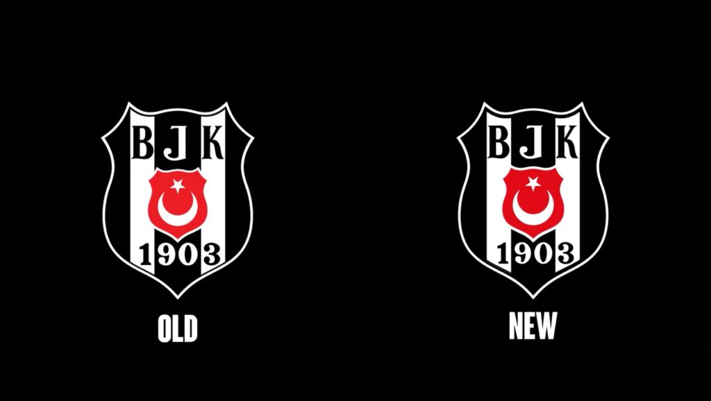
The club, a staple of Turkish football, has introduced subtle yet significant changes to its iconic emblem.
While retaining the core elements of the original logo, the updated version features refinements to various aspects, including:
- Outlines: Adjustments have been made to the thickness and precision of the outlines.
- Spacing: Modifications to the spacing between elements enhance clarity and visual balance.
- Shape: Minor alterations to the overall shape contribute to a more modern aesthetic.
- Coloring: Subtle changes to the color palette ensure a more vibrant and contemporary look.
These changes, though seemingly small, collectively contribute to a more polished and refined logo, reflecting the club’s evolution while preserving its rich heritage.
The new logo will now represent Beşiktaş JK in all official capacities.