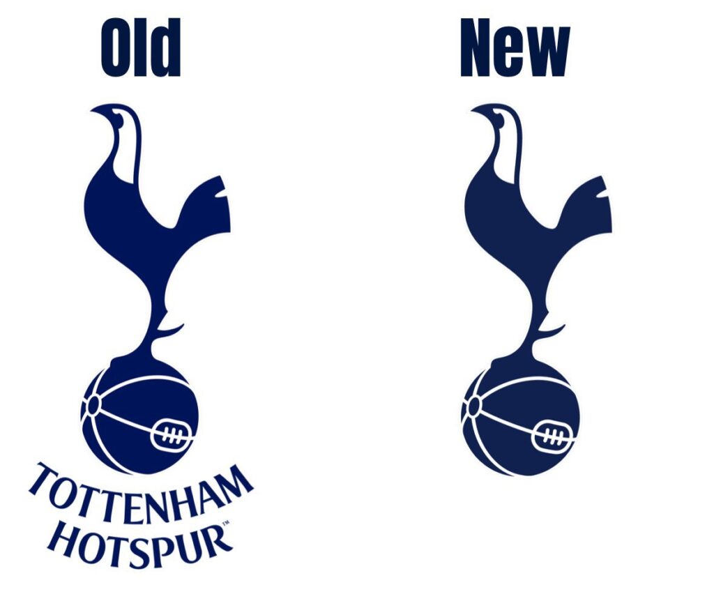
Tottenham Hotspur has unveiled a new club logo, marking a significant change to their visual identity.

The new logo retains the iconic cockerel emblem but removes the curved “Tottenham Hotspur” text beneath it.
The club has stated that this change will allow for greater flexibility and scalability across various platforms and applications.
In a statement, the club said:
“We have removed the curved Tottenham Hotspur text from beneath the cockerel. This enables us to increase its scale across different environments and stand proud as a true icon for the Club.”
The new logo is expected to be gradually implemented across all club materials and merchandise.
While the change may be subtle, it signifies a modern approach to the club’s branding and identity.


